
Step 1: Get an honest photo before you trust it
A color match is only as good as the image you start from. If the reference is your own photo, give yourself an honest one:
- Shoot in neutral daylight. Indoor bulbs push colors warm (yellow) or cool (blue). A window on an overcast day is the most trustworthy light you have at home.
- No flash, no direct glare. A flash blows out the surface into a white hot-spot that hides the real color. Soft, even light shows the paint as it is.
- Fill the frame with the color. Get close so the shade you care about is a large, flat area — not a tiny patch the camera will "average" away.
If the reference is someone else's image (box art, a photo online), you can't fix how it was shot — so lean harder on Steps 2 and 3 to sanity-check it.
Step 2: Read the mid-tone, not the highlight or the shadow
Every surface in a photo shows three different colors at once: a bright highlight, a dark shadow, and the honest mid-tone in between. Painters who match to a shiny highlight end up mixing something far too pale; those who match to a shadow mix something muddy and dark.
- Pick a spot that is evenly lit and matte — the flank of the surface, not the glossy edge catching the light.
- Ignore reflections. A red car photographed outdoors has patches of sky-blue reflection that are not the paint at all.
Step 3: Put the color into words
Once you've found the honest patch, describe it the same way you would for any mix — hue, value, saturation. Is it a warm or cool version of its color? Light or dark? Vivid or dusty? Naming it out loud stops your eye from being fooled by the colors around it.
Step 4: Know the traps a screen adds
Between the real color and your eye sit a camera and a display, and each one lies a little. Watch for these:
- White balance cast. If the whole photo leans yellow or blue, that tint is on every color in it, including your target. Find something you know is neutral gray or white in the shot; if it looks tinted, mentally correct the target the same amount.
- Punchy phone photos. Phone cameras boost saturation and contrast to look pleasing. The real object is almost always a little more muted than the screen suggests — so mix slightly softer than what you see.
- Screen brightness and angle. The same image looks lighter or darker as you tilt a phone or turn up the brightness. Judge at a normal, steady brightness, and never against a black or white background that tricks your eye.
Step 5: Match it to the paints you own, then test and record
With an honest read of the color, pick the closest paint you already have as a base and adjust one axis at a time — our guide on mixing custom colors walks through the order (value, then hue, then saturation) that saves the most repainting. Then do the thing everyone skips: test on scrap, let it fully dry, and judge it in the light the model will live in — the same daylight you shot the reference in, ideally. Wet paint reads darker, and gloss vs matte shifts it again.
When the match lands, write the ratio down. A color you matched perfectly but can't mix again is worth nothing on the second panel.
Summary
- Start from an honest photo — neutral daylight, no flash, fill the frame.
- Match to the mid-tone, never a highlight, shadow or reflection.
- Describe it in hue / value / saturation before mixing.
- Correct for screen traps: white-balance cast, boosted saturation, brightness.
- Mix from your closest paint, judge after drying, and record the ratio.
FAQ
Can you match a paint color from a picture?
Yes. A picture holds enough information to identify a paint color, as long as you read it carefully: judge the mid-tone rather than a highlight or shadow, correct for any white-balance cast, and expect a phone photo to be slightly more saturated than the real object. The five steps above walk through it, and a color-matching app can do the reading for you.
Why does the color look wrong when I paint it, even though I matched the photo?
Usually one of three traps: you matched a highlight or shadow instead of the mid-tone, the photo had a color cast that tinted every color in it, or you judged the paint while it was still wet — dried paint reads darker, and matte paint reads duller than gloss.
Is there a free app that matches model paint colors from a photo?
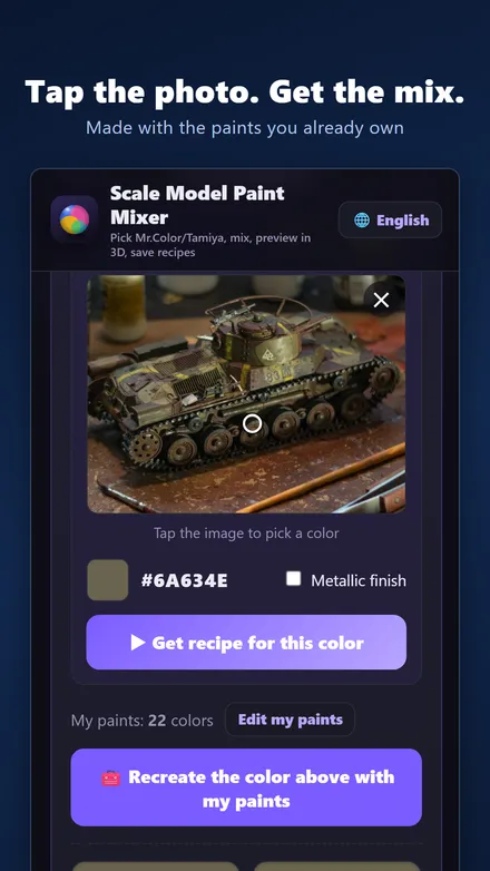
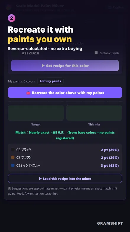
Yes — Scale Model Paint Mixer (Android, free) reads the color straight from a photo you take, then suggests a mixing recipe from the paints you already own, with a score showing how close the match is.